Android开发过程中大家一定或多或少都碰到过RecyclerView写适配器的麻烦,重复写,代码篇幅长,等等一系列的问题。今天就说说BaseRecyclerViewAdapterHelper这个帮助
节省代码量的万能适配器了,最简单的使用,能改减少适配器中一半以上的代码量。但是只是这样还是不够简单便捷,再加上一个万能的控件SuperTextView,那才可以叫做真!万能适配器!先给大家上这两个库的GitHub地址:
https://github.com/CymChad/BaseRecyclerViewAdapterHelper https://github.com/CymChad/BaseRecyclerViewAdapterHelper
GitHub - lygttpod/SuperTextView: a super textview for androida super textview for android. Contribute to lygttpod/SuperTextView development by creating an account on GitHub. https://github.com/lygttpod/SuperTextView
然后开始我们的RecyclerView万能适配器的使用步骤:
首先先在项目中集成 在app下的build.gradle文件中的dependencies加入
implementation 'com.github.lygttpod:SuperTextView:2.4.6' 超级TextVie万能控件
implementation 'com.github.CymChad:BaseRecyclerViewAdapterHelper:3.0.7' 万能适配器
记得保证根目录的 build.gradle下的repositories已经加入了
allprojects {
repositories {
...
maven { url "https:jitpack.io" }
}
}
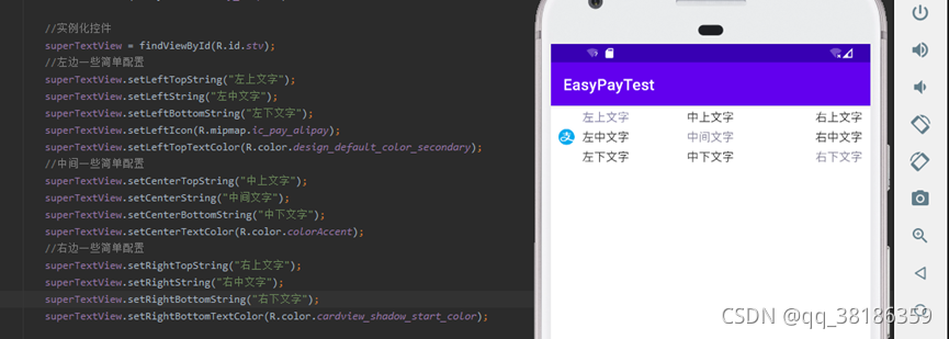
正式使用前我们得先了解一下SuperTextView, 下图是SuperTextView的作者给的一些效果图,其实大家理解SuperTextView就是一个能帮我们生成好我们常用的一些TextView、ImageView、checkBox等等一些控件并且帮我们摆放好,甚至做好了我们常用的某些效果的的工具。

为了方便大家理解,我使用SuperTextView部分属性简单写了一个效果,相信大家都能一眼就明白这些意思。

SuperTextView还有很多很多的属性设置,这些属性通通都可以在代码中以及xml中去使用。
| 属性名 | 字段 | 描述 | 默认值 |
|---|---|---|---|
| sLeftTextString | string | 左边文字字符串 | |
| sLeftTopTextString | string | 左上文字字符串 | |
| sLeftBottomTextString | string | 左下文字字符串 | |
| sCenterTextString | string | 中间文字字符串 | |
| sCenterTopTextString | string | 中上文字字符串 | |
| sCenterBottomTextString | string | 中下文字字符串 | |
| sRightTextString | string | 右边文字字符串 | |
| sRightTopTextString | string | 右上文字字符串 | |
| sRightBottomTextString | string | 右下文字字符串 | |
| sLeftTextColor | color | 左边文字颜色 | 默认0xFF373737 |
| sLeftTopTextColor | color | 左上文字颜色 | 默认0xFF373737 |
| sLeftBottomTextColor | color | 左下文字颜色 | 默认0xFF373737 |
| sCenterTextColor | color | 中间文字颜色 | 默认0xFF373737 |
| sCenterTopTextColor | color | 中上文字颜色 | 默认0xFF373737 |
| sCenterBottomTextColor | color | 中下文字颜色 | 默认0xFF373737 |
| sRightTextColor | color | 左边文字颜色 | 默认0xFF373737 |
| sRightTopTextColor | color | 右上文字颜色 | 默认0xFF373737 |
| sRightBottomTextColor | color | 右下文字颜色 | 默认0xFF373737 |
| sLeftTextSize | dimension | 左边字体大小 | 默认15sp |
| sLeftTopTextSize | dimension | 左上字体大小 | 默认15sp |
| sLeftBottomTextSize | dimension | 左下字体大小 | 默认15sp |
| sCenterTextSize | dimension | 中间字体大小 | 默认15sp |
| sCenterTopTextSize | dimension | 中上字体大小 | 默认15sp |
| sCenterBottomTextSize | dimension | 中下字体大小 | 默认15sp |
| sRightTextSize | dimension | 右边字体大小 | 默认15sp |
| sRightTopTextSize | dimension | 右上字体大小 | 默认15sp |
| sRightBottomTextSize | dimension | 右下字体大小 | 默认15sp |
| sLeftLines | integer | 左边文字显示行数 | 默认不设置 |
| sLeftTopLines | integer | 左上文字显示行数 | 默认不设置 |
| sLeftBottomLines | integer | 左下文字显示行数 | 默认不设置 |
| sCenterLines | integer | 中间文字显示行数 | 默认不设置 |
| sCenterTopLines | integer | 中上文字显示行数 | 默认不设置 |
| sCenterBottomLines | integer | 中下文字显示行数 | 默认不设置 |
| sRightLines | integer | 右边文字显示行数 | 默认不设置 |
| sRightTopLines | integer | 右上文字显示行数 | 默认不设置 |
| sRightBottomLines | integer | 右下文字显示行数 | 默认不设置 |
| sLeftMaxEms | integer | 左边文字显示个数 | 默认不设置 |
| sLeftTopMaxEms | integer | 左上文字显示个数 | 默认不设置 |
| sLeftBottomMaxEms | integer | 左下文字显示个数 | 默认不设置 |
| sCenterMaxEms | integer | 中间文字显示个数 | 默认不设置 |
| sCenterTopMaxEms | integer | 中上文字显示个数 | 默认不设置 |
| sCenterBottomMaxEms | integer | 中下文字显示个数 | 默认不设置 |
| sRightMaxEms | integer | 右边文字显示个数 | 默认不设置 |
| sRightTopMaxEms | integer | 右上文字显示个数 | 默认不设置 |
| sRightBottomMaxEms | integer | 右下文字显示个数 | 默认不设置 |
| sLeftViewGravity | enum | 左边文字对齐方式 left_center(左对齐) center(居中) right_center(右对齐) | 默认center |
| sCenterViewGravity | enum | 中间文字对齐方式 left_center(左对齐) center(居中) right_center(右对齐) | 默认center |
| sRightViewGravity | enum | 右边文字对齐方式 left_center(左对齐) center(居中) right_center(右对齐) | 默认center |
| sLeftTvDrawableLeft | reference | 左边TextView左侧的drawable | |
| sLeftTvDrawableRight | reference | 左边TextView右侧的drawable | |
| sCenterTvDrawableLeft | reference | 中间TextView左侧的drawable | |
| sCenterTvDrawableRight | reference | 中间TextView右侧的drawable | |
| sRightTvDrawableLeft | reference | 右边TextView左侧的drawable | |
| sRightTvDrawableRight | reference | 右边TextView右侧的drawable | |
| sLeftTvDrawableWidth | dimension | 左边TextView的drawable的宽度 | |
| sLeftTvDrawableHeight | dimension | 左边TextView的drawable的高度 | |
| sCenterTvDrawableWidth | dimension | 中间TextView的drawable的宽度 | |
| sCenterTvDrawableHeight | dimension | 中间TextView的drawable的高度 | |
| sRightTvDrawableWidth | dimension | 右边TextView的drawable的宽度 | |
| sRightTvDrawableHeight | dimension | 右边TextView的drawable的高度 | |
| sTextViewDrawablePadding | dimension | TextView的drawable对应的Padding | 默认10dp |
| sLeftViewWidth | dimension | 左边textView的宽度 为了中间文字左对齐的时候使用 | |
| sTopDividerLineMarginLR | dimension | 上边分割线的MarginLeft和MarginRight | 默认0dp |
| sTopDividerLineMarginLeft | dimension | 上边分割线的MarginLeft | 默认0dp |
| sTopDividerLineMarginRight | dimension | 上边分割线的MarginRight | 默认0dp |
| sBottomDividerLineMarginLR | dimension | 下边分割线的MarginLeft和MarginRigh | 默认0dp |
| sBottomDividerLineMarginLeft | dimension | 下边分割线的MarginLeft | 默认0dp |
| sBottomDividerLineMarginRight | dimension | 下边分割线的MarginRight | 默认0dp |
| sDividerLineColor | color | 分割线的颜色 | 默认0xFFE8E8E8 |
| sDividerLineHeight | dimension | 分割线的高度 | 默认0.5dp |
| sDividerLineType | enum | 分割线显示方式 none(不显示分割线) top(显示上边的分割线) bottom(显示下边的分割线) both(显示上下两条分割线) | 默认bottom |
| sLeftViewMarginLeft | dimension | 左边view的MarginLeft | 默认10dp |
| sLeftViewMarginRight | dimension | 左边view的MarginRight | 默认10dp |
| sCenterViewMarginLeft | dimension | 中间view的MarginLeft | 默认10dp |
| sCenterViewMarginRight | dimension | 中间view的MarginRight | 默认10dp |
| sRightViewMarginLeft | dimension | 右边view的MarginLeft | 默认10dp |
| sRightViewMarginRight | dimension | 右边view的MarginRight | 默认10dp |
| sLeftTextIsBold(移除) | boolean | 左边文字是否加粗 | 默认false(暂时去除此属性改为代码动态配置) |
| sLeftTopTextIsBold(移除) | boolean | 左上文字是否加粗 | 默认false(暂时去除此属性改为代码动态配置) |
| sLeftBottomTextIsBold(移除) | boolean | 左下文字是否加粗 | 默认false(暂时去除此属性改为代码动态配置) |
| sCenterTextIsBold(移除) | boolean | 中间文字是否加粗 | 默认false(暂时去除此属性改为代码动态配置) |
| sCenterTopTextIsBold(移除) | boolean | 中上文字是否加粗 | 默认false(暂时去除此属性改为代码动态配置) |
| sCenterBottomTextIsBold(移除) | boolean | 中下文字是否加粗 | 默认false(暂时去除此属性改为代码动态配置) |
| sRightTextIsBold(移除) | boolean | 右边文字是否加粗 | 默认false(暂时去除此属性改为代码动态配置) |
| sRightTopTextIsBold(移除) | boolean | 右上文字是否加粗 | 默认false(暂时去除此属性改为代码动态配置) |
| sRightBottomTextIsBold(移除) | boolean | 右下文字是否加粗 | 默认false(暂时去除此属性改为代码动态配置) |
| sLeftIconRes | reference | 左边图片资源 可以用来显示网络图片或者本地 | |
| sRightIconRes | reference | 右边图片资源 可以用来显示网络图片或者本地 | |
| sLeftIconWidth | dimension | 左边图片资源的宽度 用于固定图片大小的时候使用 | |
| sLeftIconHeight | dimension | 左边图片资源的高度 用于固定图片大小的时候使用 | |
| sRightIconWidth | dimension | 右边图片资源的宽度 用于固定图片大小的时候使用 | |
| sRightIconHeight | dimension | 右边图片资源的高度 用于固定图片大小的时候使用 | |
| sLeftIconMarginLeft | dimension | 左边图片资源的MarginLeft | 默认10dp |
| sRightIconMarginRight | dimension | 右边图片资源的MarginLeft | 默认10dp |
| sCenterSpaceHeight | dimension | 上中下三行文字的间距 | 默认5dp |
| sRightCheckBoxRes | reference | 右边CheckBox的资源 | |
| sRightCheckBoxMarginRight | dimension | 右边CheckBox的MarginRight | 默认10dp |
| sIsChecked | boolean | 右边CheckBox是否选中 | 默认 false |
| sUseRipple | boolean | 是否开启点击出现水波效果 | 默认 true |
| sBackgroundDrawableRes | reference | SuperTextView的背景资源 | |
| sRightViewType | enum | 右边显示的特殊View checkbox switchBtn | 默认都不显示 |
| sRightSwitchMarginRight | dimension | 右边SwitchBtn的MarginRight | 默认10dp |
| sSwitchIsChecked | boolean | 右边SwitchBtn是否选中 | 默认 false |
| sTextOff | string | TextOff | 默认"" |
| sTextOn | string | TextOn | 默认"" |
| sSwitchMinWidth | dimension | SwitchMinWidth | 系统默认 |
| sSwitchPadding | dimension | SwitchPadding | 系统默认 |
| sThumbTextPadding | dimension | ThumbTextPadding | 系统默认 |
| sThumbResource | reference | 右边SwitchBtn自定义选中资源 | 系统默认 |
| sTrackResource | reference | 右边SwitchBtn自定义未选中资源 | 系统默认 |
| sUseShape | boolean | 是否使用shape设置圆角及触摸反馈 设为true之后才能使用一下属性 | 默认false |
| sShapeSolidColor | color | 填充色 | 默认false |
| sShapeSelectorPressedColor | color | 按下时候的颜色 | 默认0xffffffff |
| sShapeSelectorNormalColor | color | 正常显示的颜色 | 默认0xffffffff |
| sShapeCornersRadius | dimension | 四个角的圆角半径 | 默认0dp |
| sShapeCornersTopLeftRadius | dimension | 左上角的圆角半径 | 默认0dp |
| sShapeCornersTopRightRadius | dimension | 右上角的圆角半径 | 默认0dp |
| sShapeCornersBottomLeftRadius | dimension | 左下角的圆角半径 | 默认0dp |
| sShapeCornersBottomRightRadius | dimension | 右下角的圆角半径 | 默认0dp |
| sShapeStrokeWidth | dimension | 边框宽度 | 默认0dp |
| sShapeStrokeDashWidth | dimension | 虚线宽度 | 默认0dp |
| sShapeStrokeDashGap | dimension | 虚线间隙宽度 | 默认0dp |
| sShapeStrokeColor | color | 边框颜色 | 默认0dp |
| sLeftTextBackground | reference | 左边textView的背景 | |
| sCenterTextBackground | reference | 中间textView的背景 | |
| sRightTextBackground | reference | 右边textView的背景 | |
| sLeftTextGravity | enum | 左边TextView内文字对齐方式 left(左对齐) center(居中) right(右对齐) | 默认left |
| sCenterTextGravity | enum | 中间TextView内文字对齐方式 left(左对齐) center(居中) right(右对齐) | 默认left |
| sRightTextGravity | enum | 右边TextView内文字对齐方式 left(左对齐) center(居中) right(右对齐) | 默认left |
| sLeftIconShowCircle | boolean | 左边ImageView是否显示为圆形 | 默认false |
| sRightIconShowCircle | boolean | 右边ImageView是否显示为圆形 | 默认false |
如果这些属性还不能完全满足你的要求,可以直接获取你想要修改的地方,再加工做到你需要的效果,例如你想要获取左上的文字只需要:
SuperTextView.getLeftTopTextView();
这样即可得到左上角文字返回的TextView,其他的地方也一样以此类推即可得到相对应的控件。
在了解SuperTextView的使用以后就是BaseRecyclerViewAdapterHelper的使用了。通常我们在创建适配器的时候都需要一个相对应的layout文件来写适配器的Item,但是基于但是基于SuperTextView,我们的layout文件就能变得很简单,
只需要一个SuperTextView就能满足百分之八十左右的Item需求了。
<?xml version="1.0" encoding="utf-8"?>
<LinearLayout xmlns:android="http://schemas.android.com/apk/res/android"
    android:layout_width="match_parent"
    android:layout_height="wrap_content">

    <com.allen.library.SuperTextView
        android:id="@+id/stv"
        android:padding="15dp"
        android:layout_width="match_parent"
        android:layout_height="wrap_content"
        />

</LinearLayout>
有了Item的layout文件以后我们就可以开始写适配器了。
新建一个class需要继承BaseQuickAdapter<>里面有两个泛型, 第一个是实体类,第二个直接写BaseViewHolder, 是为了支持扩展ViewHolder, 因为我们的目的是做一个万能的适配器我们需要支持所有数据类型,所以第一个实体类我们直接用Object,之后需要操作数据的时候我们再通过类型判断来强制转换成我们需要的类型即可。然后就能生成一个构造函数,以及一个convert方法,主要操作是在convert,我们这里通过构造函数传进来一个类型值,判断当前适配器需要的数据类型,以及SuperTextView需要实现的样式。
我们在convert方法中获取我们的SuperTextView控件,然后根据类型值判断需要转换的数据类型。再根据自己的需求去完成SuperTextView需要的样式,并且赋值,就完成了我们的万能适配器了。看了一大推说明,相信大家都看烦了。
小二!上代码!
首先是两个数据类型。
//一个商品相关Bean
public class MainBean {
    private String name;  //商品名称
    private String num;   //商品数量
    private String price;  //商品价格

    public MainBean(String name, String num, String price) {
        this.name = name;
        this.num = num;
        this.price = price;
    }

    public String getName() {
        return name;
    }

    public void setName(String name) {
        this.name = name;
    }

    public String getNum() {
        return num;
    }

    public void setNum(String num) {
        this.num = num;
    }

    public String getPrice() {
        return price;
    }

    public void setPrice(String price) {
        this.price = price;
    }
}
另一个数据类型
//一个学生成绩相关Bean
public class SubBean {
    private String name;  //学生姓名
    private String curriculum;  //科目
    private String number;      //学号
    private String fraction;    //分数

    public SubBean(String name, String curriculum, String number, String fraction) {
        this.name = name;
        this.curriculum = curriculum;
        this.number = number;
        this.fraction = fraction;
    }

    public String getName() {
        return name;
    }

    public void setName(String name) {
        this.name = name;
    }

    public String getCurriculum() {
        return curriculum;
    }

    public void setCurriculum(String curriculum) {
        this.curriculum = curriculum;
    }

    public String getNumber() {
        return number;
    }

    public void setNumber(String number) {
        this.number = number;
    }

    public String getFraction() {
        return fraction;
    }

    public void setFraction(String fraction) {
        this.fraction = fraction;
    }
}
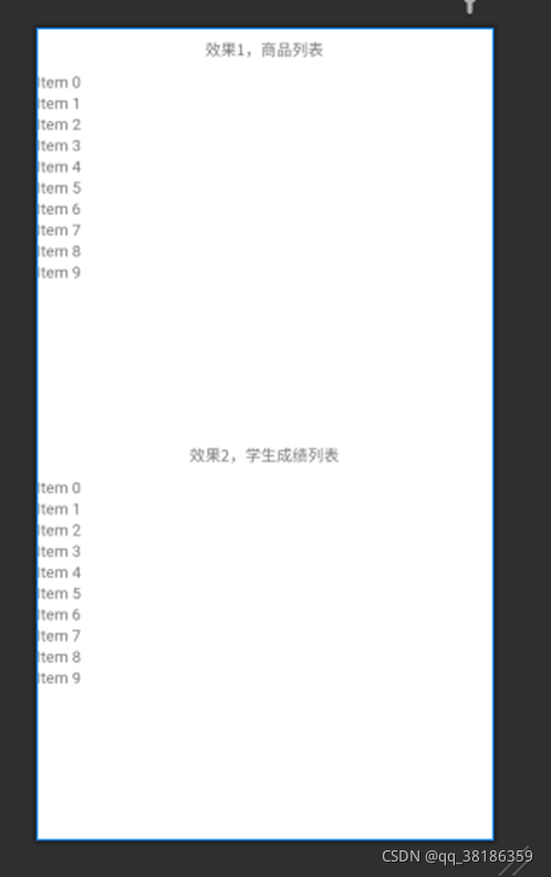
接下来我在Activity中写两个RecyclerView, 通过一个适配器实现使用两个不同的数据类型实现两个效果,首先看看xml。
<?xml version="1.0" encoding="utf-8"?>
<LinearLayout
    xmlns:android="http://schemas.android.com/apk/res/android"
    xmlns:tools="http://schemas.android.com/tools"
    android:layout_width="match_parent"
    android:layout_height="match_parent"
    android:orientation="vertical"
    tools:context=".AdapterActivity">

    <TextView
        android:layout_width="match_parent"
        android:layout_height="wrap_content"
        android:text="效果1,商品列表"
        android:layout_marginTop="10dp"
        android:layout_marginBottom="10dp"
        android:gravity="center"
        />

    <androidx.recyclerview.widget.RecyclerView
        android:id="@+id/rv_main"
        android:layout_width="match_parent"
        android:layout_height="0dp"
        android:layout_weight="1"
        />

    <TextView
        android:layout_width="match_parent"
        android:layout_height="wrap_content"
        android:text="效果2,学生成绩列表"
        android:layout_marginTop="10dp"
        android:layout_marginBottom="10dp"
        android:gravity="center"
        />

    <androidx.recyclerview.widget.RecyclerView
        android:id="@+id/rv_sub"
        android:layout_width="match_parent"
        android:layout_height="0dp"
        android:layout_weight="1"
        />


</LinearLayout>
很简单,就两个RecycleView 和两个TextView
接下来就是适配器代码:
public class Adapter extends BaseQuickAdapter<Object, BaseViewHolder> {
    private int type;
    //type为0是商品, 为1是成绩
     public Adapter(int type) {
        super(R.layout.item_adapter);
        this.type = type;
    }

    @Override
    protected void convert(BaseViewHolder baseViewHolder, Object o) {
        SuperTextView stv = baseViewHolder.getView(R.id.stv);
        //根据type区分使用的数据类型以及样式
        switch (type) {
            case 0:
                //数据类型强制转换商品列表数据
                MainBean main = (MainBean) o;
                //左边文字
                stv.setLeftString("商品名:" + main.getName());
                //中间文字
                stv.setCenterString("商品价格:" + main.getPrice());
                //右边文字
                stv.setRightString("商品数量:" + main.getNum());
                break;
            case 1:
                //数据类型强制转换学生成绩列表数据
                SubBean sub = (SubBean) o;
                //左上文字
                stv.setLeftTopString(sub.getName());
                //左下文字
                stv.setLeftBottomString(sub.getNumber());
                //右上文字
                stv.setRightTopString(sub.getCurriculum());
                //右下文字
                stv.setRightBottomString(sub.getFraction());
                break;
        }
    }

}
最后就是使用,Activity代码
public class AdapterActivity extends AppCompatActivity {
    //商品列表控件
    private RecyclerView rv_main;
    //成绩列表控件
    private RecyclerView rv_sub;
    //商品数据
    private List<MainBean> mainList = new ArrayList<>();
    //成绩数据
    private List<SubBean> subList = new ArrayList<>();
    //万能适配器
    private Adapter universalAdapter;
    @Override
    protected void onCreate(Bundle savedInstanceState) {
        super.onCreate(savedInstanceState);
        setContentView(R.layout.activity_adapter);
        //实例化
        rv_main = findViewById(R.id.rv_main);
        rv_sub = findViewById(R.id.rv_sub);
        //给数据上值
        mainList.add(new MainBean("冬瓜","50","0.98"));
        mainList.add(new MainBean("西瓜","30","0.77"));
        mainList.add(new MainBean("哈密瓜","70","0.88"));
        mainList.add(new MainBean("傻瓜","1","250"));

        subList.add(new SubBean("张三","语文","000012","90"));
        subList.add(new SubBean("张三","数学","000012","88"));
        subList.add(new SubBean("张三","英语","000012","92"));
        subList.add(new SubBean("张三","计算机","000012","0"));

        setMainAdapter();
        setSubAdapter();
    }

    private void setMainAdapter() {
        //实例化适配器
        universalAdapter = new Adapter(0);
        //配置RecyclerView
        rv_main.setLayoutManager(new LinearLayoutManager(this));
        rv_main.setAdapter(universalAdapter);
        //给适配器设置数据
        universalAdapter.setList(mainList);
        //给Item点击事件
        universalAdapter.setOnItemChildClickListener(new OnItemChildClickListener() {
            @Override
            public void onItemChildClick(@NonNull BaseQuickAdapter<?, ?> adapter, @NonNull View view, int position) {
                //这样可以获取到点击行的数据 如何使用我就不赘述了
                adapter.getData().get(position);
            }
        });
    }

    private void setSubAdapter() {
        //实例化适配器
        universalAdapter = new Adapter(1);
        //配置RecyclerView
        rv_sub.setLayoutManager(new LinearLayoutManager(this));
        rv_sub.setAdapter(universalAdapter);
        //给适配器设置数据
        universalAdapter.setList(subList);
    }

}
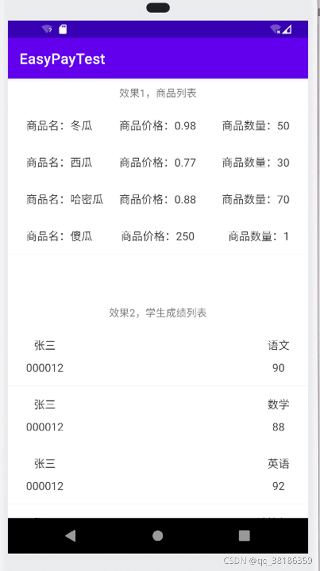
最后我们看看跑起来的样子
就这样,万能适配器的代码就讲完了,实际代码其实很少,主要是为了方便新手们理解我讲得稍微有点啰嗦了。
其实BaseRecyclerViewAdapterHelper还有很多功能大家可以自己去拓展,比如下拉菜单啊,刷新加载更多之类,SuperTextView和BaseRecyclerViewAdapterHelper远远比我介绍的强大很多很多,大家可以去github上看看源码,掌握更多的用法。
另外本人创建了个
本文链接:http://m.zhangshiyu.com/post/40442.html